|
|
Post by loserresol on Aug 14, 2008 9:05:30 GMT
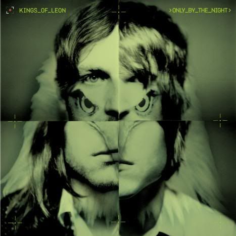
it looks like a dinasour head to me
|
|
Deleted
Deleted Member
Posts: 0
|
Post by Deleted on Aug 14, 2008 10:17:15 GMT
someone smited me- TWICE! was it because i was upset that people didn't like the artwork? Pffft! I gave you Karma, don't worry :] I lovee that white cover, if it's a cover that is. I hope that's the cover in the UK, I prefer brighter colours ^.^ |
|
|
|
Post by sd on Aug 14, 2008 10:27:00 GMT
so its a birds of prey theme then.
|
|
|
|
Post by drippingbeards on Aug 14, 2008 10:36:10 GMT
thats well cooooooooooool
for some reason it reminds me of the YAYM artwork
maybe because it has all their faces on it, joined together in some way or something.. i don't know but the album is gonna be awesome! especially now i know that some of the songs that are on it were meant to be on ASH and BOTT
EDIT: that was a reference to the first one
|
|
|
|
Post by anners on Aug 14, 2008 11:24:22 GMT
ohhh wow the other cover is awesome aswell! hmmm how intiguing, i wonder which is which. unless their red herrings and the actual one is completely different, that would be cool
|
|
|
|
Post by AccuratePassion on Aug 14, 2008 11:51:13 GMT
Reminds me of 4 Kicks!
Took me a second to realize what it was.
|
|
coco456
Innocent Smile
 HELLO PPL OF THE WORLD!
Posts: 162
|
Post by coco456 on Aug 14, 2008 19:08:53 GMT
hey the cover is my signature!
|
|
homegrown
Struttin' Now
   "I've been down to Dixie and dropped acid on my tounge, tripped upon the land til enough was enough"
Posts: 381
|
Post by homegrown on Aug 14, 2008 19:41:15 GMT
Just thought i'd mention that I saw the second (white and red) album cover when i looked at the presale for tickets to the US shows on Ticketmaster.. Hmmmm. If i were to guess i would say that must mean that they are using that one?? In the US anyway. I like them both! www.ticketmaster.com/artist/862453&tabs=mtouScroll to the bottom.. |
|
|
|
Post by Gunsfromsouth ;D on Aug 15, 2008 0:00:16 GMT
Ohh I don't like this new one  I really liked the first album cover that we saw for Only By The Night though. |
|
|
|
Post by samson on Aug 15, 2008 10:25:10 GMT
its hard to pick wich one? but the one with the chicken or what ever the fook attacking aeachother...seems more kol? but band change and develope so it could be the 1st one?
|
|
|
|
Post by Pex On Fire- on Aug 15, 2008 13:12:55 GMT
IMO  Looks like the album cover and would fit with the usual art they have on the front of their albums, whereas:  Looks more like the arty pictures they usually have from the inside of the album. Either the reverse or the centre pages? |
|
|
|
Post by anners on Aug 15, 2008 13:26:43 GMT
^^^ i think you may be right their pexbo  |
|
|
|
Post by switchbladedave on Aug 15, 2008 13:37:31 GMT
I think your right. Its a bald eagle, you can make out the white feathers. Its an ok cover, but only ok.
|
|
|
|
Post by fast3rpussycatkill on Aug 16, 2008 17:00:51 GMT
when i first looked at the cover real quick it looked a bit like two girls strangeling each other...
dun dun dunnnnnn...it's a secret image being transported into the fragile little minds of young fans everywhere!!!!!!!!
Or maybe i should have gone specsavers
|
|
|
|
Post by Viscera Eyes on Aug 16, 2008 17:31:27 GMT
The new cover is amazing.
|
|
|
|
Post by drippingbeards on Aug 16, 2008 22:57:20 GMT
hahahahahahahahahahahahahaha
|
|
|
|
Post by MrsFollowill on Aug 16, 2008 23:03:04 GMT
It could be that the red and white could be the US one and the green one could be the UK one
Like Aha Shake
(Sorry if its already be mentioned)
|
|
|
|
Post by whiskers on Aug 16, 2008 23:11:53 GMT
that's twice. *must check username before opening links*
|
|
dino
Cold as a Grave
Posts: 3
|
Post by dino on Aug 17, 2008 4:55:59 GMT
So, here it is. Most likely the original cover will be the green one, and the white one is probably for the deluxe version of the album, which will contain the remix of "the bucket" and a bonus track, called "frontier city"
|
|
|
|
Post by amycakes on Aug 17, 2008 12:59:38 GMT
i like the way it emphasises jared's reese witherspoon chin. |
|