ruby
Knocked Up
 Some like it HOT
Posts: 477
|
Post by ruby on Feb 11, 2007 15:52:16 GMT
ahh thank you luv  |
|
|
|
Post by Lihllvmch on Feb 11, 2007 16:14:45 GMT
Eureka! Its Coventry Garden! 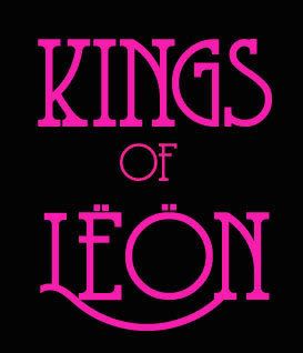 You get the Cursives by selecting capitals so you can put cursive tails on any of them. I got so excited I can't remember where i got it... [Edit] click the sample for a download page  Oh! you're right =D thank you so much karma x |
|
Adam
Cold as a Grave
King Of The Rodeo
Posts: 30
|
Post by Adam on Feb 11, 2007 18:19:16 GMT
Ahh you legend! That looks ace... just a crap play around.. i'm not all that good with photoshop! use it if you want   |
|
|
|
Post by milacamila on Feb 11, 2007 23:20:46 GMT
Eureka! Its Coventry Garden! You get the Cursives by selecting capitals so you can put cursive tails on any of them. I got so excited I can't remember where i got it... [Edit] click the sample for a download page Ohhhh!!!! Thank you sooooo much!!!! I really wanted that!!!!! Karma!!!!! |
|
|
|
Post by Good Lord Its Me Jane on Feb 11, 2007 23:39:53 GMT
Awh! *feels all warm and fuzzy* Glad to be of help |
|
|
|
Post by milacamila on Feb 12, 2007 20:09:06 GMT
Ahh you legend! That looks ace... just a crap play around.. i'm not all that good with photoshop! use it if you want Oh my, what I did wrong? You used photoshop??? cause with me, it didn't work so well...I can't get the "oooops effect" under the font (neither photoshop, illustrator, corel...just the stupid microsoft word....  )...It's never so easy as it seems... by the way, nice work! |
|
|
|
Post by Good Lord Its Me Jane on Feb 12, 2007 20:15:25 GMT
Erm do you mean the tail conecting the L and N in Leon? Or the Picture effect Adam used? *pops of to see if its a Word ting* It does seem to behave a bit naughty in Word. Ah I see what might be the problem! Because the tail comes from capitals Word likes a capital at the start of each line. So automatically will put a capital on Kings and of when you only want one on Leon. But if you keep changing it eventually it'll do it.
|
|
|
|
Post by milacamila on Feb 13, 2007 12:11:52 GMT
Erm do you mean the tail conecting the L and N in Leon? Or the Picture effect Adam used? *pops of to see if its a Word ting* It does seem to behave a bit naughty in Word. Ah I see what might be the problem! Because the tail comes from capitals Word likes a capital at the start of each line. So automatically will put a capital on Kings and of when you only want one on Leon. But if you keep changing it eventually it'll do it. Yep!!!! "ooops" means tail... Yeah, you were right...now it works perfectly, I think I was with the caps lock on...Thank you, again! . Next time I promise to try a little bit more instead of bothering first.... |
|
|
|
Post by Good Lord Its Me Jane on Feb 13, 2007 12:14:02 GMT
Awh its no bother at all. |
|
|
|
Post by monikaelizabethpar on Feb 20, 2007 4:49:18 GMT
AW CAN ANYONE TELL ME HOW TO PASTE IMAGES ON THIS BOARD!?? I KNOW IM DUMB!!!  |
|
|
|
Post by Good Lord Its Me Jane on Feb 20, 2007 13:29:28 GMT
|
|
|
|
Post by Good Lord Its Me Jane on Feb 25, 2007 17:41:17 GMT
EEEK! Now its Arial with a little messing with the Kerning. I'm a little disapointed to be honest..
|
|
|
|
Post by mynameisdominic on Mar 3, 2007 2:15:58 GMT
aaargh how do you put it on oyur computer its not wrokingo n mine.
|
|
|
|
Post by Good Lord Its Me Jane on Mar 3, 2007 10:21:26 GMT
Whats your operating system?
|
|
k
Cold as a Grave
Posts: 82
|
Post by k on Mar 22, 2007 22:25:45 GMT
sorry to reawaken this topic (with a slightly off topic question), but does anyone know either of the fonts being used on the final(lightbulb) version of the album cover?
i know a lot of people don't seem to like them, but i work in a school designing publications and what not - and would really like to use them (particularly the band name font) in the future.
thanks.
|
|
|
|
Post by Lihllvmch on Mar 22, 2007 22:37:58 GMT
As Drivër said, think is arial
|
|
k
Cold as a Grave
Posts: 82
|
Post by k on Mar 22, 2007 22:56:21 GMT
it isn't arial - i've just checked and it is particularly noticeable on the o which is a perfect circle (not in arial), and the k.
thanks for the suggestion though!
|
|
|
|
Post by Good Lord Its Me Jane on Mar 23, 2007 12:23:16 GMT
Well its deffinately the same font family (Ie a Helvetica rip off) it could be heltetica I just thought anyone who threw such ugly type on cd cover would be "Arial that'll do". I have an alergy to all that family of fonts.
|
|
k
Cold as a Grave
Posts: 82
|
Post by k on Mar 25, 2007 20:22:26 GMT
i noticed today that it is the same font as used by netto - for those that don't know, it is a discount store in europe ( www.netto.co.uk/). |
|
|
|
Post by Good Lord Its Me Jane on Mar 25, 2007 20:30:31 GMT
Awh! Netto I like their little Doggie so why has it never botherd me with Netto. Hmm Helvetica Black?  |
|